Maybe your buttons look different on every page, or your brand colors seem to shift like a chameleon. That's where a design system comes in handy.
It's like a rulebook for your designs, keeping everything consistent and organized.
In this post, we'll learn how to build a scalable design system in Figma so your designs can grow with your company.
We'll cover everything from planning and building to documenting and scaling so you can create a system that's both powerful and user-friendly. Let's dive in!
Planning Your Design System
Okay, so you're ready to dive into the world of design systems! But before we start building, we need a plan. It's like building a house – you wouldn't start without a blueprint, right?
Here's how to lay the groundwork for your awesome design system:
Figure out your goals: What do you want your design system to do? Do you want to make your website look more professional? Do you want to make it easier for your team to work together? Write down your goals so you can always stay focused.
Know your audience: Who will be using your design system? Is it just for the design team, or will developers be using it too? Understanding your users will help you build a system that works for everyone.
Check out your current designs: Take a look at your existing website or app. Are the colors all over the place? Do the buttons look different on each page? This "design audit" helps you find inconsistencies and things you can improve.
Set some ground rules: Decide who's in charge of the design system. How will you make changes and keep everything organized? This is like creating a "rulebook" for your designs.
Think about the basics: Even a basic design system needs a solid UI kit. This includes things like your color palette, fonts, and spacing. Don't forget about light and dark modes – they're super important these days!
By following these steps, you'll create a solid foundation for your design system. It's like making a recipe for a delicious cake - you need the right ingredients and measurements before you start baking!
Building the Foundation
Alright, we've got our blueprint ready! Now, it's the time to start building the foundation of our design system.
Think of these as the essential building blocks – like the bricks, cement, and wood that hold everything together.
Here are the key elements you'll need:
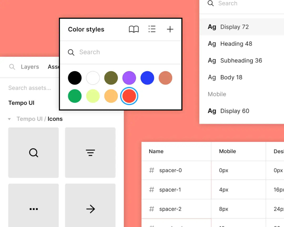
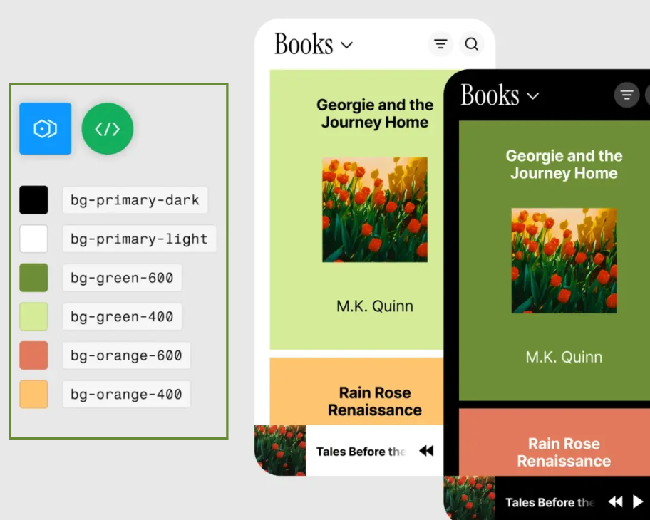
Color Palette:
Choose a set of colors that represent the brand. Think of your favorite superhero – they probably have signature colors, right?
You'll need main colors, supporting colors, and maybe some accent colors for special occasions.
Make sure your colors look good together and are easy to read, even for people with color blindness.
Figma lets you create color styles so you can easily use the same colors throughout your designs.
Typography:
Pick fonts that are easy to read and match your brand's personality. Is your brand playful or serious? Choose fonts that reflect that.
You'll need different font sizes for headings, body text, and captions.
Make sure your fonts work well together and look good on different screen sizes.
Just like with colors, you can create text styles in Figma.
Spacing and Grids:
Imagine building a house with LEGOs. You need to make sure everything lines up nicely, right? Spacing and grids help you do that in your designs.
They create a sense of order and make your designs look neat.
Iconography:
Icons are like little pictures that represent different things. Think of the icons on your phone – they tell you what each app does.
Choose icons that are simple, clear, and consistent with your brand.
You can find lots of free icons in the Figma Community.
Imagery:
If you're using photos or illustrations, make sure they're high-quality and look good on different devices.
Think about how your images will look in both light and dark modes.
By carefully choosing these core elements, you'll create a strong and consistent foundation for your design system.
It's like building a solid base for your LEGO masterpiece – it needs to be sturdy enough to support everything you build on top of it!
Remember, these elements can be defined with design tokens, which are like variables that store values for colors, fonts, and spacing.
This makes it super easy to update your design system later on. Just change the token, and it updates everywhere!
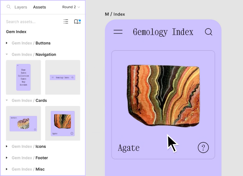
Creating Reusable Components
Okay, we've got our foundation set! Now, let's start building some cool stuff.
This is where we create components, like LEGO bricks, that we can use over and over again in our designs.
Think about your favorite video game. It probably has different characters, objects, and backgrounds, right? Those are like components!
They make it easier to build complex things without starting from scratch every time.
Here are some essential components you'll need in your design system:
Buttons:
These are like the controls in your video game. They tell the user what to do, like "Play Now" or "Add to Cart."
You'll need different types of buttons, like primary buttons (for the most important actions) and secondary buttons.
Make sure your buttons look good in both light and dark mode.
Form Elements:
These are the things you use to fill out information online, like text boxes, dropdowns, and checkboxes.
Make sure they're easy to use and understand.
Navigation:
This is how users move around your website or app. Think of it like a map that helps them find their way.
You'll need menus, links, and maybe even breadcrumbs (like Hansel and Gretel used!).
Cards:
These are like containers for information. Think of them like trading cards that show different characters or items.
You can use cards to display product information, news articles, or anything else you want to organize.
Modals and Dialogs:
These are pop-up windows that appear when you need to do something specific, like confirm a purchase or change your settings.
By creating reusable components, you'll save a lot of time and effort. It's like having a simple box of LEGO bricks that you can use to build anything you want!
Plus, it ensures that your designs are consistent and easy to use.
Even a simple design system can have a big impact. You don't need to create everything from scratch.
You can even find pre-made components in the Figma Community or look at open design systems for inspiration.
Just remember to customize them to match your brand.
Documentation and Collaboration
You've built an awesome design system with cool colors, fonts, and components. But what good is it if nobody knows how to use it?
That's where documentation comes in. Think of it like an instruction manual for your design system.
Here's how to make your design system easy to understand and use:
Create a Design System Hub:
This is like a central library where you keep all your design system information. You can use a tool like Zeroheight or Storybook or even just a dedicated page in Figma.
Make sure it's organized and easy to navigate. Think of it like a well-organized library with different sections for different types of books.
Write Clear Instructions:
Use simple language that everyone can understand. Avoid using fancy design jargon that might confuse people.
Include lots of pictures and examples. It's like showing someone how to build a LEGO model instead of just giving them written instructions.
Explain how to use each component and style correctly.
Teamwork Makes the Dream Work:
Designers and developers need to work together to make the design system a success.
Encourage everyone to share their feedback & ideas. It's like brainstorming the coolest LEGO creation ever!
Figma has some cool tools that make it very easy for designers & developers to work together.
Keep Things Up-to-Date:
Your design system will probably change over time, just like the favorite video game gets updates and new levels.
Make sure your documentation is always current. It's like having the latest version of the instruction manual.
Keep track of all the changes you make in a changelog. This is like a history book for your design system.
By documenting your design system and encouraging collaboration, you'll ensure that everyone is on the same page.
It's like having a shared set of LEGO instructions so everyone can build amazing things together!
Remember to keep your files organized and use a version control system. This is like saving your LEGO creation so you don't lose all your hard work!
Scaling Your Design System for the Future
Congratulations! You've built a fantastic design system. But, like a video game character, it needs to level up as you progress.
That's what scaling is all about – making sure your design system can grow and adapt as your needs change.
Here's how to make your design system future-proof:
Plan for Growth:
Think about how your design system can handle new challenges and features. It's like planning for your video game character to gain new skills and abilities.
Design your system with flexibility in mind. It should be like a transformer that can adapt to different situations.
Figma has a cool feature called branching that lets you experiment with new ideas without messing up your main file.
Listen to Feedback:
Ask people who use your design system what they think. It's like getting advice from experienced players in your favorite video game.
Use their feedback to make your system even better. Think of it like getting tips on how to beat a tough level.
Keep Learning:
The world of design is always changing, just like new video games are released all the time.
Stay updated on the new technologies & design trends. It's like learning new strategies and techniques to improve your gameplay.
Explore new tools and concepts that can make your design system even more awesome.
By following these tips, you'll create a design system that can scale and evolve with your needs.
It's like having a video game character that can level up and become even more powerful!
Remember, your design system is a living thing.
It needs to be nurtured and cared for. Keep it organized, update it regularly, and don't be afraid to experiment. And most importantly, have fun!
Bonus Tip: As your design system grows, you might want to think about connecting it to your code. This means that when you update a component in Figma, the code automatically updates, too! This is super advanced stuff, but it's something to keep in mind for the future.
Conclusion
So, there you have it! We've journeyed through the exciting world of design systems, from the basic concept to scaling for the future.
Remember, a good design system is like a well-organized LEGO set with all the bricks you need to build amazing things.
By using variants, keeping your colors and fonts consistent, and documenting everything clearly, you can create a design system that's both powerful and user-friendly.
Now, go forth and build awesome designs! And don't forget to have fun along the way!
Frequently Asked Questions
What's the difference between a design system and a UI kit?
A UI kit is like a toolbox with ready-made design elements like buttons and icons. A design system is more like a whole workshop, including the toolbox (UI kit), plus guidelines on how to use those tools and rules to ensure everything works together seamlessly.
Can I create a design system even if I'm not a designer?
Absolutely! While design skills are helpful, a basic understanding of design principles and Figma is enough to get started. There are plenty of resources & templates available online to guide you. Plus, collaboration with designers can be incredibly valuable.
How do I make sure my design system stays up-to-date?
Regularly review and update your design system based on feedback from your team & changes in design trends. Think of it like keeping your software updated to have the latest features & bug fixes.
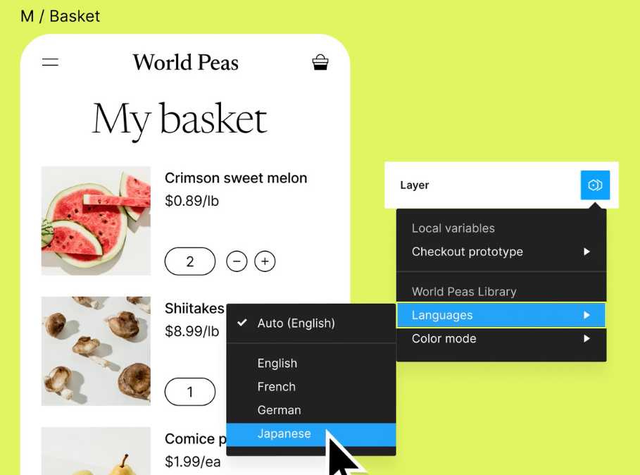
What if my design system needs to support multiple brands?
That's where things get interesting! You can create a core design system with shared elements and then create variations or branches for each brand, allowing for flexibility while maintaining consistency.
Are there any free resources or tools I can use to build my design system?
Yes! Figma itself has a free plan, and the Figma Community offers tons of free resources like icons, components, and even complete design systems. You can also find free documentation tools and resources online.