Official brand hub
Buzzy brand guidelines
Use this page to keep Buzzy consistent across campaigns, websites, partner materials, and affiliate placements.
Brand essence
What Buzzy is trying to communicate
Positioning, personality, and messaging for how Buzzy should show up in public.
Positioning statement
Buzzy helps teams turn prompts, designs, and system inputs into governed digital products without inheriting the fragility and maintenance sprawl that usually follows fast AI app creation.
Governed innovation
Position Buzzy as a way to move quickly without letting quality, structure, or control collapse.
Production credibility
Show that Buzzy is built for real outcomes, not just prototypes and demos.
Practical acceleration
Emphasize speed in service of real delivery, not speed for its own sake.
- Clear over clever
- Technical but approachable
- Confident without overclaiming
- Modern, fast, and practical
Buzzy is
- A platform brand for credible, fast-moving digital delivery.
Buzzy is not
- A playful meme brand, a generic AI wrapper, or a chaotic startup aesthetic.
Voice and tone
How Buzzy should sound in public
Use simple, confident language that explains complex capability without drifting into hype, vagueness, or technical clutter.
Explain the substance
Lead with what Buzzy does, why it matters, and what changes for the audience.
Sound assured, not inflated
Use direct statements and grounded claims instead of dramatic superlatives.
Keep complexity readable
Translate technical ideas into language a strategic buyer or marketing audience can follow.
Do
- “Turn prompts and designs into governed digital products without adding avoidable technical debt.”
- “Move from concept to production faster while keeping structure, consistency, and control intact.”
Avoid
- “Unlimited AI magic for every app idea.”
- “Disrupt everything instantly with autonomous generation.”
Logo usage
Use approved marks carefully and consistently
Use the Buzzy mark and wordmark consistently across marketing, partner, and affiliate materials. Keep applications clean, legible, and close to the current site expression.

Do
- Use the Buzzy mark or current website wordmark without distortion.
- Keep strong contrast around the logo; use light surfaces when presenting the black SVG mark.
Do not
- Do not recolor the mark arbitrarily or add effects that reduce legibility.
To be done: Clear-space and misuse examples still need to be supplied.
Color system
Current website palette as the working baseline
Use this palette across outward-facing materials. --primary and --accent are the core theme tokens; red, pink, and green stay as utility accents, including lighter or darker shades where needed.
Core brand and tone accents
Primary
Theme token Primary actions, emphasis, key highlights
text-primary / bg-primary --primary #0da2e7 13, 162, 231 199 89% 48% Accent
Theme token Brighter cyan highlight for active or product-accent moments
text-accent / bg-accent --accent #20bdf7 32, 189, 247 197 92% 55% Danger red
Tailwind utility Warnings, avoid states, risk framing
text-red-500 / bg-red-500 n/a #ef4444 239, 68, 68 0 84% 60% Contrast pink
Tailwind utility Proof accents and contrast moments
text-fuchsia-500 / bg-fuchsia-500 n/a #d946ef 217, 70, 239 292 84% 61% Proof green
Tailwind utility Positive proof and success accents
text-green-500 / bg-green-500 n/a #22c55e 34, 197, 94 142 71% 45% Neutrals, surfaces, and text
Background
Custom site token Main dark canvas
bg-background --background #0d0e12 13, 14, 18 228 16% 6% Card
Custom site token Contained surfaces and panels
bg-card --card #13151b 19, 21, 27 228 16% 9% Muted
Custom site token Quiet surfaces and subtle grouping
bg-muted --muted #1d1e26 29, 30, 38 228 14% 13% Foreground
Custom site token Primary text and high-contrast UI
text-foreground --foreground #f3f4f7 243, 244, 247 220 20% 96% Muted foreground
Custom site token Secondary text and annotations
text-muted-foreground --muted-foreground #a2a7b4 162, 167, 180 221 11% 67% Border
Custom site token Dividers, keylines, and framing
border-border --border #323643 50, 54, 67 227 14% 23% Do
- Use color with restraint; let contrast and composition do most of the work.
- Treat --primary and --accent as the core theme tokens for brand and highlight moments.
- Use Tailwind utility reds, pinks, and greens as situational accents, and reach for lighter or darker shades such as red-200 or green-400 when the context calls for it.
Avoid
- Do not let accent colors compete equally across the same layout.
- Do not imply that red, pink, or green are first-class theme tokens before the system actually defines them that way.
- Do not rely on low-contrast accent-on-accent combinations on dark backgrounds.
Typography
Use clean, modern type with deliberate contrast
Use the same clear type system across web, campaign, partner, and affiliate materials.
1rem
Use 1rem body copy at 1.5 line height and 400 weight. For longer marketing copy, keep the measure near max-w-2xl (42rem).
Tight leading
H1-H3 use 500 weight, 1.05 line height, and slightly negative tracking for compact, confident display text.
Mono accent
Use 0.75rem mono at 600 weight with 0.14em tracking for eyebrows and labels. Inline code and compact snippets use 0.75rem on muted surfaces.
Inter
View on Google FontsUse for headlines, body copy, UI text, and most public-facing content.
Development without the technical debt
Governed delivery, not generated clutter
Lead with a clear benefit
Supporting heading
Body copy should stay readable, calm, and compact across standard marketing-page widths.
"Segoe UI", "Helvetica Neue", sans-serif
JetBrains Mono
View on Google FontsUse for eyebrows, labels, and short code treatments such as inline code or compact snippets.
MARKETING SECTION
Use bg-primary for emphasis.
const tone = 'governed';Use inline code and compact snippets sparingly for technical references, tokens, and implementation-facing cues. Prefer the existing code treatment rather than inventing a separate chip style.
"SFMono-Regular", "Consolas", monospace
Do
- Keep headline typography tight, confident, and relatively compact.
- Use body copy that stays highly readable at marketing-page widths.
- Use mono sparingly as a brand accent for labels, inline code, and short technical snippets.
Avoid
- Do not overuse mono for long passages or primary marketing copy.
- Do not let headlines become oversized and loose when a tighter hierarchy would read faster.
- Do not mix in extra type styles that compete with the established display and mono contrast.
Icons
Use icons consistently
Use the same Lucide icon style across the website and workspace touchpoints so search, actions, status, and navigation cues all feel consistent.
Set
Use Lucide for website UI icons. Keep logos, social platform marks, and illustration assets separate from this icon system.
Defaults
Use the standard Lucide rendering: 24 by 24, 2px stroke, round caps and joins, and currentColor.
Role
Use icons to support actions, status, search, navigation, and compact UI cues. Keep them secondary to the main message.
Do
- Use Lucide for generic website actions, navigation, and status moments.
- Keep icon sizing predictable and let text or button color drive the icon color.
- Use the default 24 by 24, 2px stroke setup as the baseline reference even when UI contexts render smaller.
Avoid
- Do not mix multiple generic UI icon families across the website.
- Do not change stroke widths ad hoc or restyle icons into a different visual language.
- Do not replace logos, social platform marks, or product imagery with Lucide equivalents.
Imagery and graphics
Make visuals feel intentional, technical, and credible
Lead with clarity and atmosphere. Show the platform with confidence, avoid generic stock-heavy compositions, and keep visual storytelling grounded in real product capability.
Show real capability
Favor product screenshots, diagrams, and system visuals that explain what Buzzy does.
Build atmosphere with structure
Use gradients, beams, grids, and depth subtly to create a technical, premium feel.
Avoid generic AI visuals
Do not rely on abstract sci-fi clichés, random bots, irrelevant stock scenes, or AI fever-dream spectacle.
Do

Simple emotive scene
Use simple, moderately emotive imagery when it stays visually calm, readable, and aligned with the product story.
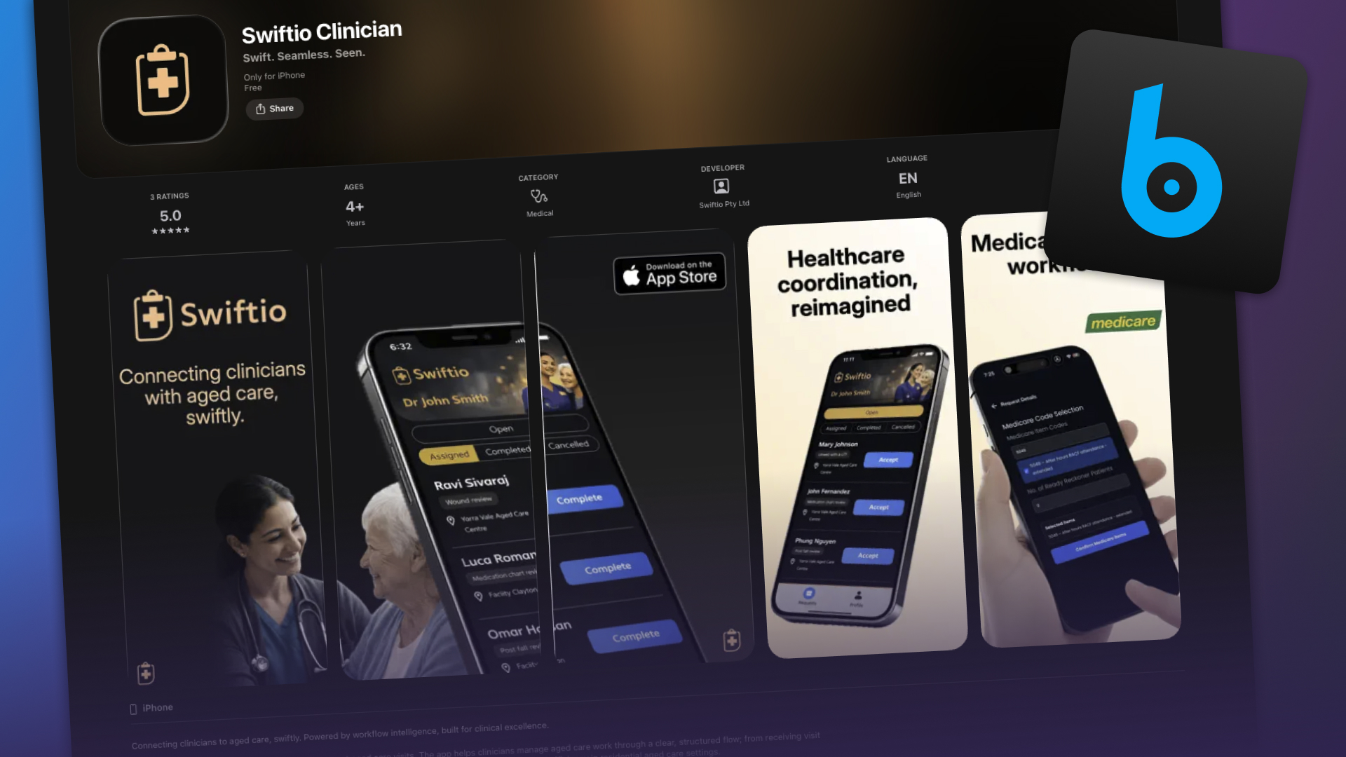
Product interface framing
Use stylised product shots, interface crops, and composites when they stay anchored to the real product and a credible outcome.
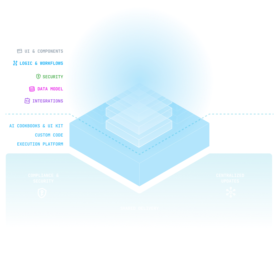
Stylised system diagram
Use diagrams when they explain system thinking clearly, with one idea, strong hierarchy, and restrained visual complexity.
Don't
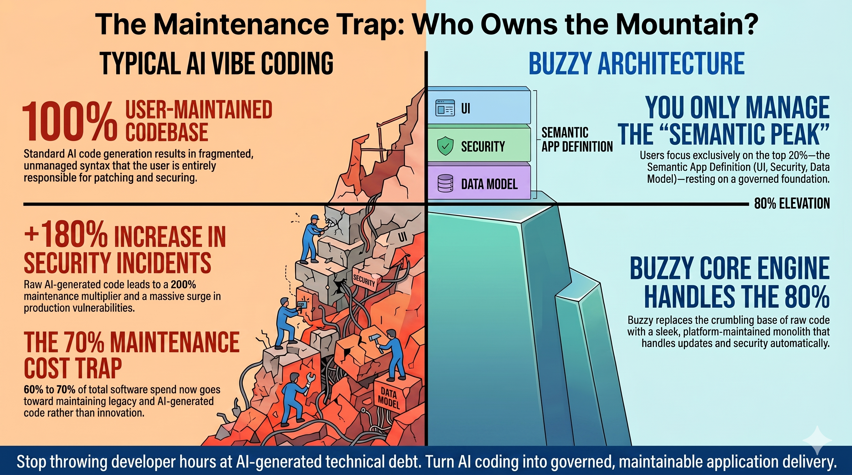
Crowded comparison graphic
Avoid crowded graphics with multiple competing ideas, dense text, and too much explanation to be readable at card size.

AI collage overload
Avoid overloaded AI collages or pitch-deck hellscapes that compete with the message instead of clarifying it.

Over-literal AI fantasy
Avoid generic cyborg, robot, or sci-fi future imagery when it signals AI but says nothing specific about the product or the outcome.
Do
- Use screenshots that feel clean, credible, and framed intentionally.
- Use simple, emotive graphics when they sharpen the narrative without becoming literal stock illustration.
- Use stylised product shots and diagrams to simplify system ideas rather than decorate them.
- Keep icons simple and geometric.
Avoid
- Do not rely on generic sci-fi AI motifs, glowing robots, or stock-heavy filler imagery.
- Do not use generic office or c-suite stock photography when it does not communicate a specific Buzzy outcome.
- Do not use chaotic AI collages, surreal composites, or hellscape pitch-deck imagery as a substitute for a clear point.
- Do not overload social graphics with multiple competing messages or focal points.
- Do not use ornamental diagrams that add complexity without explanation.
Hey, what gives?! The blog imagery came from an older SEO-driven content stream. Some posts still reflect a more literal, stock-led, or AI-generated visual direction than the one this page recommends.
Marketing patterns
Reusable public-facing UI patterns
Use these patterns for landing pages, campaign sections, and outward-facing brand moments.
AI speed.
Governed delivery.
Marketing section
Lead with a clear headline and short explanation.
Section intros should orient the reader quickly before any supporting visual or proof.
Do
- Use clear CTAs with one primary action and one secondary path.
- Use borders, spacing, and hierarchy before adding more contained panels.
- Use section intros that combine a mono eyebrow, strong heading, and concise explanatory copy.
Avoid
- Do not turn marketing sections into dense component catalogs or dashboard-style layouts.
- Do not stack multiple equally weighted calls to action in the same moment.
- Do not add extra containment when spacing and keylines already do the job.
Asset downloads
Use the current public asset set
Download the approved logos, marks, favicons, and icons used across marketing, partner, and affiliate materials.
Logos
Wordmark - black (SVG)
Primary dark-on-light vector wordmark
Wordmark - colour (SVG)
Colour SVG wordmark for public-facing use
Wordmark - white (SVG)
Light-on-dark vector wordmark
Wordmark - black (PNG)
Quick-use raster export
Wordmark - colour (PNG)
Quick-use raster export
Wordmark - white (PNG)
Quick-use raster export
Brand mark

Brand mark - default (SVG)
Standalone brand mark for general use
Brand mark - black (SVG)
High-contrast brand mark for light surfaces
Brand mark - white (SVG)
Reversed brand mark for dark surfaces
Brand mark - transparent (PNG)
Quick-use raster export
Brand mark - white background (PNG)
Quick-use raster export
Favicons
App and social icons
Transparent icon 32
Square transparent PNG for compact avatars and UI
Transparent icon 128
Small social and deck-friendly PNG
Transparent icon 512
General-purpose square export
Transparent icon 1024
Large-format export for presentations and stores
White-background icon 32
Square icon with white backing for constrained placements
White-background icon 128
Square icon with white backing for constrained placements
White-background icon 512
Square icon with white backing for constrained placements
White-background icon 1024
Square icon with white backing for constrained placements
Still to gather: Package the public files into a clean downloadable zip with partner-facing filenames. Add light and dark usage notes where partners need clearer direction. Add partner or co-branding guidance for shared-logo placements.